iRis AG Released!
So for the past few months I have been working for Rogue Pirate Ninja interactive on a game for the iPhone called iRis. The game is a 3D tile matching game much like Columns or Tetris , with the cool twist that instead of moving the falling block as it descends, you rotate the rest of the world underneath it. It’s pretty darn fun and we’re all rather proud to have made it. So without further ado here’s the trailer:
So what are you waiting for? It’s only $2 on the iPhone App Store, so Go buy it! Anyway, I thought I’d write up a post about what it’s been like working on the game. More after the jump… iRis AG Development: The development for iRis was based around a small team of people, led by Jonathan Wolf, also the main programmer on board. Along with myself - the artist on the team, and Bradley Burr, who did the music and sound, we formed the core team that worked on iRis. For a full list of the awesome people who made the game possible check out the RPNi site. For the art production, I used my favourite open source tools: Blender, GIMP, and Inkscape. Blender for Developing iPhone Games: I should point out that we don’t use blender’s game engine for the game. Rather we use our own engine called geWiz ES. To get assets into the game, we used a custom python script that exports an xml file very similar to the collada format, though pared down to just what we need, with a couple of features that collada lacks. From the export we can then load the assets pretty easily into the game engine, and this allowed us to be pretty flexible in making adjustments during the games development. All of the 3D assets were created in blender, along with the majority of the animations for the UI elements and animated backdrops, and since I could easily render out previews of the animations in blender we could rapidly see what the end resulyt would look like in game without even having to do an export. A great example of this is the galaxy model, used as a backdrop to the main menu. I originally produced it just as a concept which I rendered in blender, but with very little tweaking to optimise the poly count, it quickly became an asset that was part of the final product. Here’s a video of the galaxy rendered in blender from early in development, compare it to the one in the background of the trailer video above.
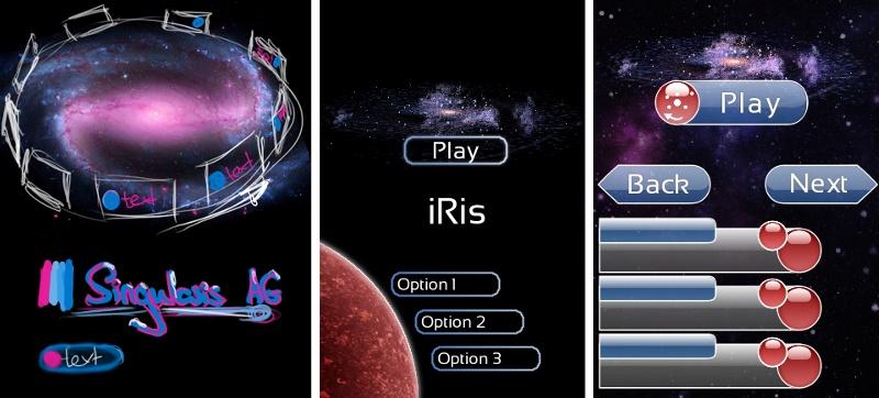
This kind of flexibility was a great asset to us and came in handy in creating mockups and prototypes before wading into big elements of the game. In particular, because we are a geographically widespread team (split between the US and the UK) collaborating using subversion, we couldn’t have made the game without it. Similarly for a lot of the 2D elements mockups were created in GIMP showing what the final screen would look like.
Various iterations of the main menu done in GIMP
Rolling with the changes: As in any production, changes are made along the way, and in the case of iRis some major changes were made to the visual look of the main game fairly late-on in development. I felt that the original look of the main game was somewhat cluttered and certain elements which contributed little to gameplay were taking up disproportionately large amounts of screen real-estate, not to mention development time. Thanks to some quick mockups made in Blender and the GIMP, I was able to convince the rest of the team of this fairly quickly and deliver a simpler look for the main game pretty quickly, ultimately reducing the development time and improving the look of the game. Sometimes less is more, and much as I had worked hard on the assets that got canned, at the end of the day we made the game better.
A few assets we decided to drop from the game. Each was animated and built up out of nothing over the course of play. Whist this looked great, it took up too much room on screen for a hand-held device.
The finished product: We’re all really proud of the game, it’s great fun to play and it looks great too. As our first iPhone game, and the first to use our engine, we think the results are great, and now we’ve got one under our belts the next is going to be even better. Go and check out the game for yourself, it’s only $2, with a free demo version coming soon.
Comments
Mike (Oct 17, 2009)
Right on! Game looks nice, and its interesting that those more detailed objects didn’t translate well onto the handheld screen.
app, big projects, game, game work, iphone, linkedin — Oct 16, 2009